
The Color of a Feeling: Art, Atmosphere, and the Room You Live In
· DecorumBY Journal

Before you notice a room’s individual pieces, you often notice its atmosphere. Color helps set that first impression: a cool wash across a wall, a red passage in a painting, a luminous green that holds your eye.
For an interior to feel personal, its palette needs more than coordination. It needs a point of view. Artwork is an unusually good place to begin because it already contains a conversation between colors, light, movement, and space. You can borrow that conversation without copying every shade.
What color research actually tells us
A 2025 review by Domicele Jonauskaite and Christine Mohr brought together 132 studies involving more than 42,000 participants. It found recurring links between colors and emotional ideas, with hue, lightness, and saturation all contributing. The authors also draw an essential distinction: associating a color with an emotion does not establish that the color will produce that feeling in a particular room.
That is a useful invitation to be observant. “Blue” alone cannot describe the difference between a misty coastal photograph and an electric cobalt abstraction. Your memories, preferences, the amount of color, and the setting belong in the decision too. There is no universal paint-by-number formula for a happy home.
Choose the feeling before the accessories
Ask how you want to use the space. An intimate sitting room may invite a restrained field of color and a work that rewards a closer look. A lively entertaining space may welcome a stronger contrast or a more active composition. Those are design directions to test, rather than promises about how a guest will feel.
Start with the artwork you want to live with. Name its dominant color, then find a quieter secondary note. In Amalgam, the blue and warm red-pink passages offer several routes. A blue textile can establish continuity; a small warm ceramic can answer the other side of the image. The room does not need a separate accessory for every color in the piece.
Give a strong color something to work against
A saturated artwork can hold a room together even when the sofa, walls, and curtains are neutral. Its impact often comes from that breathing room. If the art, rug, upholstery, and cushions all compete at equal intensity, the eye has fewer places to pause.
For a gentler composition, vary light and dark values within a related family, then introduce contrast through material: woven fabric, warm wood, a smooth table surface. Let one element be the surprise. A room that feels collected rarely needs everything to agree perfectly.
Make the final decision at home
Look at the proposed artwork beside your actual finishes in daylight and again under evening lamps. A screen is a starting point; a material sample and the real wall reveal more about glare, scale, and relationships. Notice whether the art still attracts you when the room is in use.
The most convincing palette is one you want to return to. Choose a work for its own character, borrow a few of its cues, and leave space for your life to complicate the composition.
From the DecorumBY collection
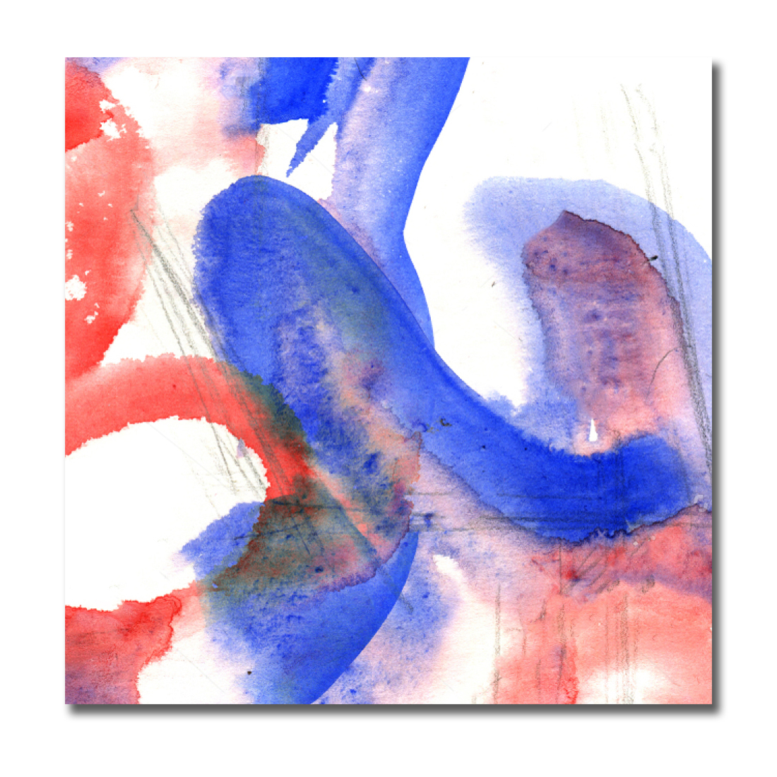
Amalgam pairs cool blues with warm red and pink passages. Draw out one family for the room and let the other remain a deliberate accent.

Aqua offers a different starting point: a largely tonal field with visible marks. Consider it beside warm timber and textured ivory rather than surrounding it with identical turquoise.

Emerald Flame gives a restrained room a vivid focal point. Let a small echo of green or warm gold connect it to the furnishings.