
A Room You Can Almost Touch: Bringing Art and Texture Together
· DecorumBY Journal
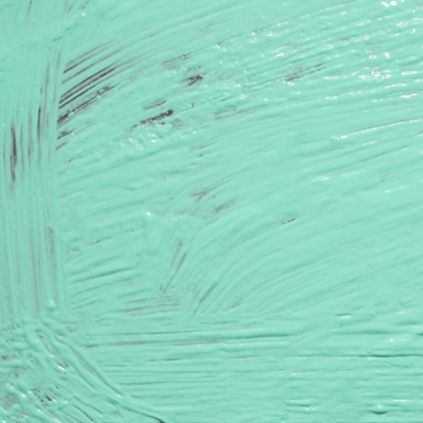
Some rooms are beautifully coordinated and still feel unfinished. The colors agree, the furniture fits, yet the space asks for another layer. Often the missing ingredient is a richer exchange between surfaces—and artwork can begin it.
Think of a tailored linen sofa beside a polished table, or pale plaster behind an image full of sweeping marks. The interest lives in the difference. A room becomes more engaging when the eye can move between crisp and soft, fine and coarse, quiet and animated.
The texture you see and the surface you touch
The J. Paul Getty Museum’s guide to the elements of art explains texture as a quality perceived by sight and touch, and notes that a surface can look different from how it feels. Oxford University Press’s texture exercise similarly distinguishes the appearance of texture in a photograph from its usually smooth physical surface.
That distinction matters when buying wall art. An image of expressive brushwork can bring a sense of movement into a room, but a digital print does not acquire raised paint simply because the original image depicts it. The image and the material carrying it are two separate design choices.
Find a relationship, rather than a match
Begin with the room’s strongest material. If it is a heavily woven rug, ask whether the artwork should continue that visual activity or provide relief. A quieter composition can keep the floor from competing with the wall. In a room of smooth finishes, a more visibly worked image can introduce an engaging counterpoint.
With Aqua, the marks within the image offer a useful contrast to a clean-lined console. A woven cushion nearby can carry the idea of texture into the seating without imitating the artwork. Keep the connection broad: a shared softness, a repeated curve, a related color temperature.
Repeat a gesture across different materials
A sweeping line in a work might find an echo in a rounded chair back. A tight, rhythmic pattern could converse with a fine weave. These are subtler relationships than matching the print to the pillows, and they leave the room room to grow.
Try choosing one repeated idea and one deliberate contrast. A curving artwork above a rectangular cabinet already establishes a useful tension. Add a ceramic object with a related silhouette, then stop and look. More layers do not automatically create more depth; some surfaces need to remain quiet.
Choose the finish in the actual light
Compare available acrylic, aluminum, canvas, and framed-print options for the specific piece rather than assuming every work has identical construction. Consider reflections from windows, the surrounding furniture, and the distance from which the image will be viewed. A finish that looks striking in one room may compete with the light in another.
Use samples where available and confirm the product specification. Then edit the arrangement as a whole. When the artwork, textiles, furniture, and architecture each contribute something different, the room can feel connected without becoming a matching set.
From the DecorumBY collection
Aqua’s marks suggest texture visually. A printed image of a mark does not mean the finished panel has raised paint; choose its substrate separately.

Fog’s light and dark folds can sit comfortably beside woven upholstery and clean architectural lines. Let the visual softness answer a more structured room.

Emerald Flame introduces sweeping movement. A simple backdrop lets those curves converse with a rounded chair or a curved table edge.