
Let the Artwork Lead: Building a Color Palette That Feels Like Home
· DecorumBY Journal

Art is often treated as the final item in a room, chosen to match colors that are already settled. Try reversing the process. A work you love can offer a richer starting point: not just a hue, but a relationship between bold and quiet, warm and cool, light and dark. The room can grow from that relationship without becoming a literal copy of the image.
Choose a lead color and an accent
Look at the artwork from across the room. Which color feels dominant, and which smaller note catches your attention? Let the dominant family influence a larger element, such as upholstery or a rug, while the accent appears in a cushion, a ceramic object, or a trim detail. Leave some colors in the artwork alone. Selective repetition feels more natural than a complete inventory.
Decide between harmony and contrast
Neighboring colors can create a gentle transition, while colors from opposite sides of the color wheel can create a stronger contrast. Blue and orange are a familiar complementary pairing; in a room, that might become a blue artwork with a restrained terracotta accent. The goal is balance, not equal quantities of every color.
Work with what belongs to the home
Flooring, wood tones, stone, and daylight are already part of the palette. Place fabric and paint samples beside the artwork in the room itself, and look again at different times of day. A screen is a useful starting point, but it cannot settle every material decision. Notice undertones as well as color names: two neutrals can feel very different beside the same image.
Use shape and placement as part of the edit
A bright circular work can become a lively punctuation mark; a panoramic image can stretch a color story across a long wall. In a mixed arrangement, repeat one color across pieces while varying scale or shape. Keep a few quiet areas so the eye can distinguish each work. A common frame finish can help tie together images that have very different subjects.
A finished home does not need every piece to match. It needs relationships that feel considered. Let the artwork introduce the conversation, then use color, texture, and proportion to make the rest of the room respond.
From the DecorumBY collection
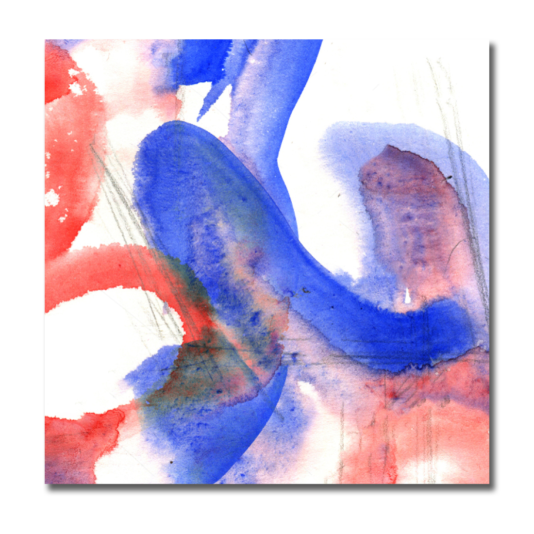
Amalgam offers several possible starting points. Pick one main color and one smaller accent rather than matching every shade.

Aqua suggests a quieter tonal route. Echo its family of color through different textures and lighter or darker values.

Emerald Flame can become a vivid focal point. Let a restrained backdrop and a small warm accent support its movement.